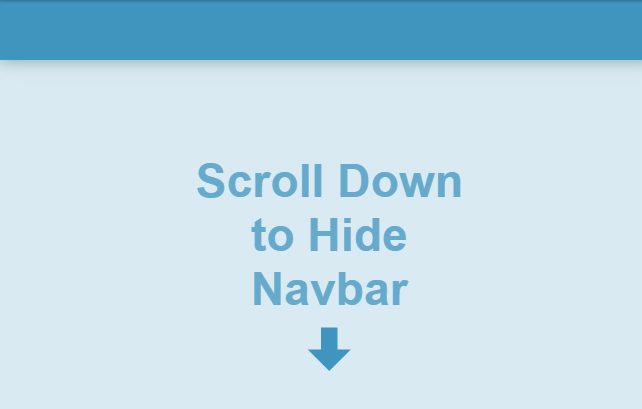
"스크롤이 올라가면 ...... 내려가면 ......"
[원문] https://medium.com/@Taha_Shashtari/hide-navbar-on-scroll-down-in-vue-fb85acbdddfe
Hide Navbar on Scroll Down in Vue
Content focused sites usually improve the user experience by reducing the distraction when it’s possible. And one way to achieve this is…
medium.com
Vue.js 프로젝트를 진행중이다. 스크롤 업/다운의 경우 jQuery와 Javascript로 할 경우는 해본 경험이 있기에 Vue.js에서도 어렵지 않게 쓸 수 있었다. 다만, 한국어 자료를 찾기 힘들고 구글링에서 헤매는 사람이 있을까 싶어서 오늘의 포스팅을 해본다.
이슈
- 스크롤을 위로 향해서 화면이 아래로 갈 때 : 헤더 또는 GNB 영역이 사라짐
- 스크롤을 아래로 향해서 화면이 위로 갈 때 : 헤더 또는 GNB 영역이 나타남
해결
Vue.js의 특징 중 하나인 data값과 클래스 바인딩을 사용해서 스크롤 이벤트에 따라 클래스가 추가/삭제된다.
Vue.js 사용 명령어
html
- :class or v-bind:class
script
- data
- mounted
- beforeDestroy
- methods
콘텐츠 중심 사이트는 가급적 산만함을 줄여 사용자 경험을 개선한다. 이를 위한 방법으로 사용자 아래로 스크롤할 때 '특정영역'을 숨기고 위로 스크롤할 때 다시 표시하는 것이다.
Vue.js에서 해당 동작을 구현하는 것은 매우 쉽다. Codepen 데모를 확인해보자.
See the Pen Hide NavBar on Scroll Down by 이수연 (@llbitkbn-the-bashful) on CodePen.
1. 상단 고정바 만들기
이 데모에는 App.vue라는 단일 구성 요소만 필요하다. 따라서 생성한 다음 Instant Prototyping을 사용하여 실행한다.
vue serve App.vue다음은 아래와 템플릿 섹션을 만든다.
<template>
  <div class="app">
    <div
      class="navbar"
      :class="{ 'navbar--hidden': !showNavbar }"
    ></div>
  </div>
</template>
상단바가 단순한 div이며 showNavbar라는 data은 false로 조건을 설정한다.
*아직 showNavbar와 .navbar-hidden 클래스는 정의하지 않았다. 먼저, .navbar-hidden부터 정의해보자.
* {
  box-sizing: border-box;
}
body {
  padding: 0;
  margin: 0;
}
.app {
  width: 100vw;
  height: 500vh;
  background: hsl(200, 50%, 90%);
}
.navbar {
  height: 60px;
  width: 100vw;
  background: hsl(200, 50%, 50%);
  position: fixed;
  box-shadow: 0 2px 15px rgba(71, 120, 120, 0.5);
  transform: translate3d(0, 0, 0);
  transition: 0.1s all ease-out;
}
.navbar.navbar--hidden {
  box-shadow: none;
  transform: translate3d(0, -100%, 0);
}
참고
스크롤을 위한 공간을 확보하기 위해 .app에 height: 500vh가 있다.(테스트를 위해). 탐색 표시줄에는 position: fixed가 있어 스크롤하는 동안 고정된다. 상단바가 숨겨져 있을 때, transform: translate3d로 높이와 정확히 같은 양만큼 위로 이동하도록 업데이트한다.
2. 스크롤을 내릴 때 숨기기
navbar를 숨기려면 showNavbar를 false로 설정하기만 하면 된다. 그러나 사용자가 아래로 스크롤할 때만 이 작업을 수행해야 한다. 그리고 마지막 스크롤 위치를 저장하여 스크롤 방향을 감지하고 현재 스크롤 위치와 비교할 수 있다. currentScrollPosition < lastScrollPosition이면 상단바를 표시하고 그렇지 않으면 숨긴다.
따라서 showNavbar 및 lastScrollPosition의 두 가지 데이터 속성을 정의해야 합니다.
export default {
  data () {
    return {
      showNavbar: true,
      lastScrollPosition: 0
    }
  }
}
이제 페이지가 로드되면 창에서 스크롤 이벤트를 수신 대기를 해야한다.
mounted () {
  window.addEventListener('scroll', this.onScroll)
},
beforeDestroy () {
  window.removeEventListener('scroll', this.onScroll)
}
다음은 중요한 기능인 핸들러 기능이다.
methods: {
  onScroll () {
    // Get the current scroll position
    const currentScrollPosition = window.pageYOffset || document.documentElement.scrollTop
    // Because of momentum scrolling on mobiles, we shouldn't continue if it is less than zero
    if (currentScrollPosition < 0) {
      return
    }
    // Here we determine whether we need to show or hide the navbar
    this.showNavbar = currentScrollPosition < this.lastScrollPosition
    // Set the current scroll position as the last scroll position
    this.lastScrollPosition = currentScrollPosition
  }
}
브라우저에서 확인하면 아래로 스크롤하기 시작하면(1픽셀이라도) 상단바가 숨겨져 있는 것을 볼 수 있다. 그러나 숨기거나 표시하기 전에 몇 픽셀이 지나야할 수 도 있다. 핸들러에서 간단한 검사를 해보자.
3. 상단바를 숨기거나 표시하기 전에 스크롤 오프셋 추가
onScroll 메소드를 다음과 같이 업데이트한다.
onScroll () {
  const currentScrollPosition = window.pageYOffset || document.documentElement.scrollTop
  if (currentScrollPosition < 0) {
    return
  }
  // Stop executing this function if the difference between
  // current scroll position and last scroll position is less than some offset
  if (Math.abs(currentScrollPosition - this.lastScrollPosition) < 60) {
    return
  }
  this.showNavbar = currentScrollPosition < this.lastScrollPosition
  this.lastScrollPosition = currentScrollPosition
}
변경된 코드를 적용하면 현재 스크롤 위치와 마지막 스크롤 위치 간의 차이가 선택한 오프셋(이 예에서는 60px)보다 작아질 때까지 showNavbar를 업데이트하지 않는다.
이제 60px 이상 위/아래로 스크롤하면 상단바는 숨겨지거나 표시됩니다.
https://codepen.io/tahazsh/pen/wNOvyK
Hide NavBar on Scroll Down
...
codepen.io
'IT' 카테고리의 다른 글
| 애플 신제품 아이폰13 발표. 아이폰12 왜 샀지..? 혁신보다 성능 향상에 포커스를 맞췄다!(개인적 실망감 추가) (12) | 2021.09.15 |
|---|---|
| 맥북을 기다리는 1인에게 보내져온 애플 신제품 발표 초대장! (1) | 2021.09.09 |
| [CSS] 포토샵 px과 css의 letter-spacing 값을 어떻게 넣어야 할까? 변화해주는 사이트 공유! (0) | 2021.03.29 |
| [텔레그램] 클럽하우스 업그레이드판을 만들어낸 텔레그램 음성대화 2.0 (0) | 2021.03.25 |
| 모바일 웹에서 스크롤 표시 어떻게 없앨까요? 스크롤 잔상 없애는 방법! (0) | 2021.03.17 |


